Contributing this post is Agustin Sanchez, Melificent’s husband, 1/2 of concert duo extraordinaire, and partner in crime. Melificent needs to take a day or two off this week, so I’ll be stepping in.
So, I recently was re-organizing the office/spare room in our place and I came across some of the original sketches that I had made when Meli and I were mulling over ideas for all the printed materials for our wedding. As a backstory, Meli and I have been married just shy of two years (anniversary is November 17th!!) and have been together somewhere around 8 years.
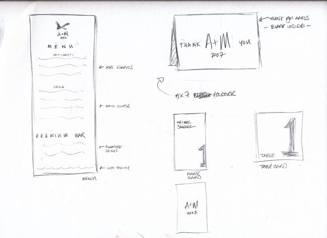
Experience in being a designer for the past few years has taught me that quickly sketching out my ideas helps me to both connect the dots and to convey what’s in my head to others in ways that I cannot do with words. Meli was able to quickly understand many of the objectives I wanted to achieve in the design.
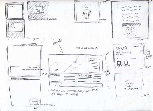
Looking back, a lot of my initial instincts ended up being executed pretty closely. I’m an Art Director at a digital advertising agency, so I usually deal with intangible deployments (HTML Sites, iPhone Apps, Flash Initiatives, etc). So whenever I get to print anything it’s a huge novelty for me. I love it. It’s like most girls I know and Red Velvet cupcakes.
Anyone who works with me will recognize the sketch style above. I’m constantly sketching out ideas during meetings on notebooks, scraps of paper & white boards. You know you’re a designer when you’d rather draw out soemthing to illustrate a point rather than talk…
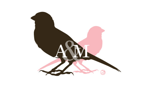
The design cues for the entire wedding started with our logo/monogram. My wife decided on our color palette, pink + brown. She wanted a sort of hot pink, but I swayed her towards a carnation pink, that leaned a little into an orangey tone.
Off the bat I knew I wanted to feature birds, and then I got the idea of using two birds: one representing me and one representing her. Meli is an extremely petite little girl, while I clock in somewhere around 6’2″. I was really happy with the way the logo came out, and most people commented that they instantly got it, which of course makes you feel good.
I also put my initial, A before her M, which is not very traditional, but it looked like it was spelling out MA (you, know like mom or mum) and we agreed that it felt a little weird.
Once we had our aesthetic everything else fell into place. I used a serif font (Old Style 7 SmallCaps) which lent an established and traditional feel to all the printed materials, but paired it with watermarked Asian-design glyphs (not kanji symbols, but asian floral patterns). Everything else fell into place after that. I tried to push the fun, in places where it seemed interesing (CD Labels, Ceremony Programs) but held back on stuff like the menus and invites.
Below are a few of the finished designs from the files I used to print things.
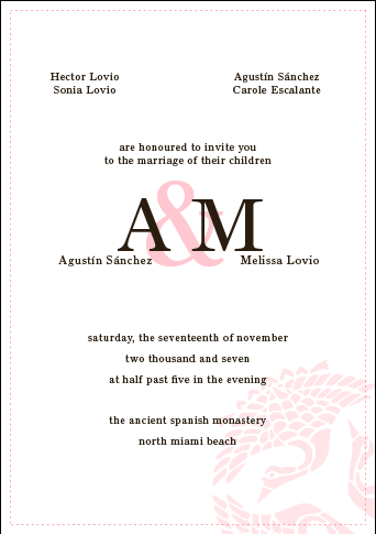
Invitation Insert
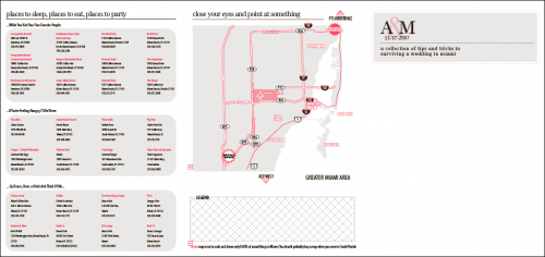
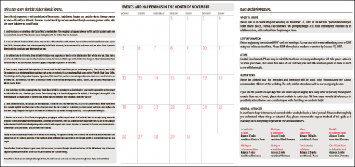
Guide to Surviving Miami
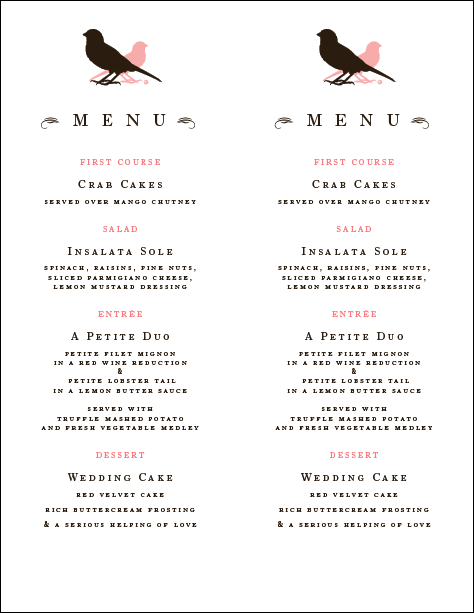
Menus (2-up)
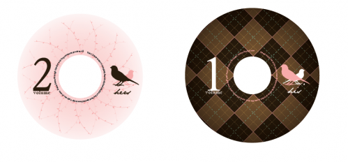
CD-Favor Labels
There are tons of little things that I can’t show here(this is already way longer than an average post), but I think I’ve shown enough to communicate the vibe we were going for. Designing for our wedding was one of my favorite projects I’ve ever worked on. Late nights of folding, printing, designing, planning with one of the toughest clients I’ve yet to meet (waves!! hi honey!!).
It was all worth it in the end. 🙂
Nadia says
LOVE your sketches…I h ope you don’t lose those…I’m sure your future kid(s) would get a real kick out of seeing them 😉
Love you guys! Have to hang out soon! xoxo
Jackie G. says
Fabulous post, Augi! I love the attention to detail…everything from the paired down glyps, the meaning behind the birds and the type choices. Fantastic! I love Meli to death, but I think you gave her a run for her money on this post…really enjoyed! I hope my wedding theme/invites come out half as classy and beautiful!
xoxo
Ang says
Mmm…the menu…
Adrienne says
hi augi! great post :]
question: what did you guys print the invitation inserts on?
Meli says
Heaviest cardstock we found at Staples. We had to print it on our home printer, so we couldn’t use anything too fancy unfortunately. Now we have a really kick ass photo printer, which def. would have come in handy for those projects!